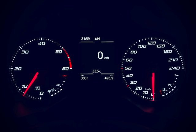
A gauge chart, often used in business settings to visualize key performance indicators and other metrics, boasts a unique and intriguing name. But where does the name come from? Does it have anything to do with gauges used in other fields? How did it evolve into the data visualization tool that it is today? Keep reading to learn more about the fascinating journey of the gauge chart.

Understanding Gauge Chart Essentials
In the world of data visualization, charts play a key role. They provide a tidier and more effective way of presenting complex statistics or data analytics. Among various types of charts, a gauge chart stands out with its unique appearance and the data it represents.
A gauge chart, or a speedometer chart as some analysts refer to it, contains a semi-circular scale representing a definite measure. Colors differentiate each segment of this scale, reflecting the communal, average, or critical values. The needle in the chart indicates the measure or value in focus.
Its design is similar to an automobile’s speedometer, which may leave you wondering: was an automobile’s gauge the inspiration behind a gauge chart? To better comprehend this, let’s delve into the chart’s history.
Essentially, a gauge chart works as a visual aid. Businesses often utilize this instrument to monitor the progress toward meeting a set target or achieving a key performance indicator (KPI).
Historical Overview: Emergence of the Gauge Chart
The gauge chart, as we know it, is not an ancient concept. The need for modern, more precise ways to present data led to its emergence. However, its precursor, the automobile gauge, came into being in the late 19th to early 20th centuries.
Back then, automobile companies began incorporating gauges into their vehicles to measure speed, fuel, and engine temperature. This move was a transition from outdated arrow indicators to a more comprehensive and accurate display of crucial data.
The success of these gauges in vehicles sparked interest in similar visual representations in other fields. As the world became more digital, this concept transitioned into what we recognize today as the gauge chart.
Several industries, especially those heavily reliant on data and metrics, appreciated this new visualization tool. Businesses started using it to track performance, monitor KPIs, and reach their goals more effectively.
The Intriguing Discovery: Gauge Chart’s Naming Origin
The name “gauge” originates from the Middle English word “gaugen” which means to measure. This term, now synonymous with precision measurement, eventually extended its reach to various fields including steam engines, firearms, and yes, automobiles.
The term “gauge” took a leap from a simple measurement tool, to become a symbol of precision and accuracy. In the automotive industry, it signified a device used to read the values in a car to ensure safe and efficient driving. The analogy was very fitting for what we now call a “gauge chart.”
So, it’s not a surprise that when a data visualization tool resembling a car’s speedometer emerged, it was bestowed with the name gauge chart.
Transforming Data Visualization: Power of Gauge Chart
The evolution of the gauge is Undoubtedly a testimony to human ingenuity. Adopting a simple concept from the automobile industry, it has transformed the face of data visualization.
Today, a gauge is widely regarded as an effective tool for encapsulating complex data in color-differentiated, circular form. It’s a go-to chart when it comes to comparing performance measures against set targets.
Furthermore, it’s easy to understand. Even those who are not familiar with interpreting statistical data can comprehend a gauge chart with ease. It binds complicated data in a simple yet elegant way, that could be easily interpreted at a single glance.
Overall, from its naming origin to its practical use, the gauge continues to evolve with the changing needs of businesses, while maintaining its primary function: to provide a clearer, more effective way of visualizing data. Its journey, from the dashboard of vehicles to the hands of data analysts and strategists, demonstrates how a simple concept, if employed properly, can literally transform the landscape of a field, in this case, data visualization.
